Fuck you, poorly-designed Ticketmaster website
Recently, I had to update the address that Ticketmaster had for me. Simple in theory, but incredibly difficult in practice. I'll show you every annoyance I encountered.
The Update Delivery Address box doesn't work
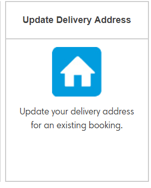
First I had to find out how to actually change my address. After some searching, I found a box on the Ticketmaster's Customer Service page that says, "Update Delivery Address".

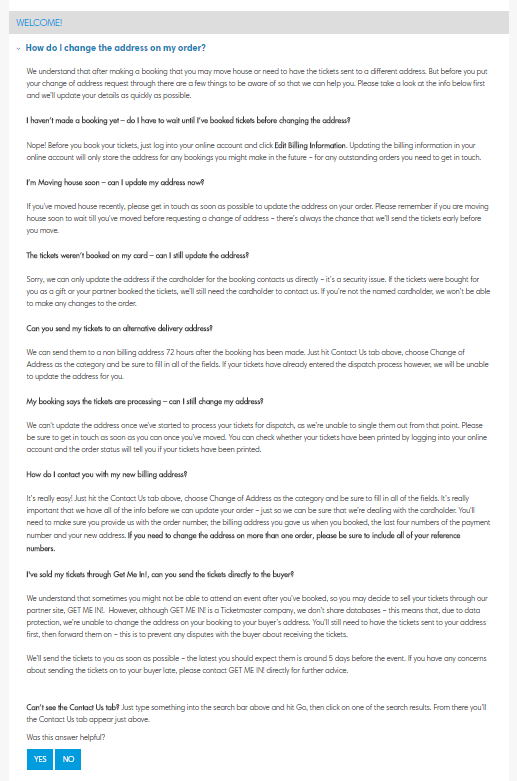
But when I clicked on the box, a wall of text appeared. Goddammit, I just want to change my delivery address, not read the fucking Iliad.

I skimmed the wall of text and found the relevant part. It read:
Just hit the Contact Us tab above, choose Change of Address as the category and be sure to fill in all of the fields.
So I knew I had to find this fabled 'Contact Us tab'.
The Contact Us button opens an FAQ
I found what seemed to be it. It says 'Contact Us' so this must be it.

But when I clicked it, another another wall of text appeared! This is like reading War and Peace just after finishing The Iliad.

There's a second Contact Us button on the same page
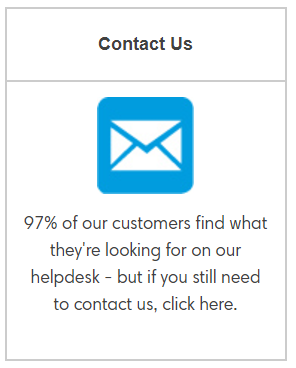
It turns out I was meant to click a different Contact Us button on the same page:

So there's two boxes that say 'Contact us' and only one is the real one. It's like one box is a Pikachu and the other one is Ditto pretending to be a Pikachu.
Sometimes the Contact Us button goes missing
Usually the Contact Us button is near the top of the screen, like here:

But right now, as I'm writing these words, the buttons look like this:

So where the hell is the Contact Us button? I have no idea where it went. To find the answer, I looked at the page source. It turns out that the Contact Us button is still there in the code, but now it has a class called 'oculted' which means 'hidden'.

So it seems Ticketmaster hides the contact button when they don't want to deal with customers anymore.
The Contact Us button isn't clickable
When the Contact Us button was visible, I tried to click it but nothing happened (see Figure 1). That's because you have to click on the words contact us (as in Figure 2). Clicking on the box around the text does nothing.

But when you hover your cursor over the box, it turns blue, implying that you can click it. Fucking hell.
Shitty annoying popups
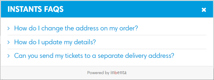
I managed to reach the Contact Us page. As I filled in the form, an eager popup appeared called "INSTANTS FAQS".

Dropdown box has only one option in it
There's a dropdown box wth only has one option in it. Why not just get rid of this box altogether?

Another annoying popup box
Suddenly another wild INSTANTS FAQS popup box appeared.

Ticketmaster wants my event name, event venue, event date...
Next the form wants to know my booking reference number, the event name, the event venue and the event date! Surely Ticketmaster should be able to find this information from the booking reference number alone? Dealing with Ticketmaster is like dealing with a person with dementia.

A third popup box
When I tried to enter the Event Name, another INSTANTS FAQS popup box appeared. This one said, "Why can't I print off my Ticketfast tickets?" Well, I don't know. Is it because your website is shit?

"Question"
The last box says 'Question'. What question? I'm not asking a question, I'm trying to change my address. Perhaps the question is "Why is this site so shit?"

A fourth popup box
When I tried to fill in the 'Question' box, another one of the motherflipping INSTANTS FAQS boxes appeared. Ticketmaster must really want you to read the FAQs, probably to lighten the burden on their customer support team.

"Submit your question"
The submit box says SUBMIT YOUR QUESTION. What question? I'm just trying to change my address.

A fifth popup box
I clicked SUBMIT YOUR QUESTION and another popup box appeared. It said BEFORE YOU CONTINUE, DO ANY OF THESE HELP? No they don't bloody help so just fuck off back to hell and let me submit the form you cunt.

Conclusion
In the end, I did manage to update my address, so the story has a happy ending at least. I've also learned that I would rather drink a puddle of panda piss than deal with the Ticketmaster website again.


Comments
2021-07-30 john Jarman
Sorry to disagree but I don't think the website is poorly designed at al. The crooked fucks at Ticketmaster have put a huge amount of work into ensuring it does precisely what they want it to do, that is, to prevent any customer ever contacting them for any reason other than to take your money. Once they have your money, they do everything possible to prevent contact. FUCK TICKETMASTER, FUCK THEM TO HELL AND BACK
Reply
Leave a comment