Photos of graffiti in Montreal
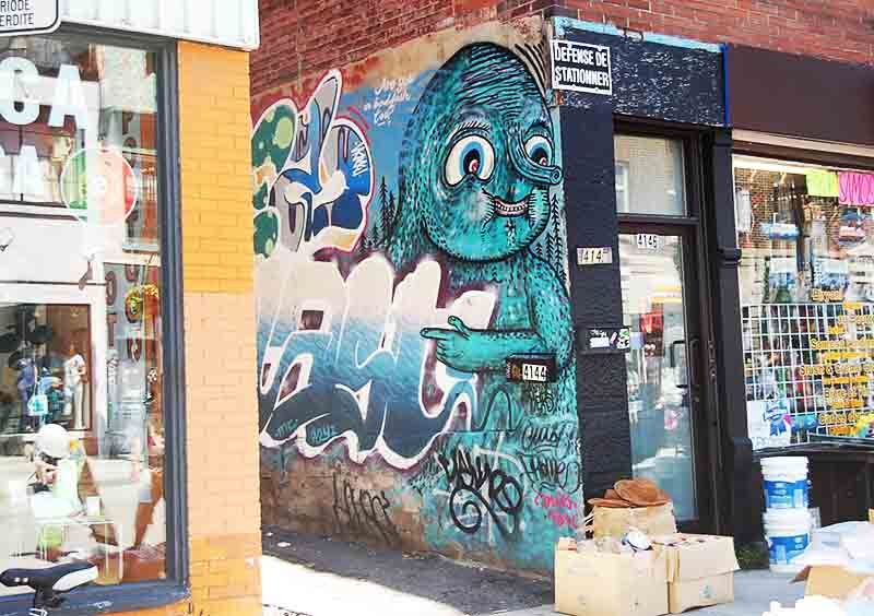
Montreal is a special place. It's dark, subversive, and yet gayer than a swan riding a rainbow. This is reflected in the city's graffiti.
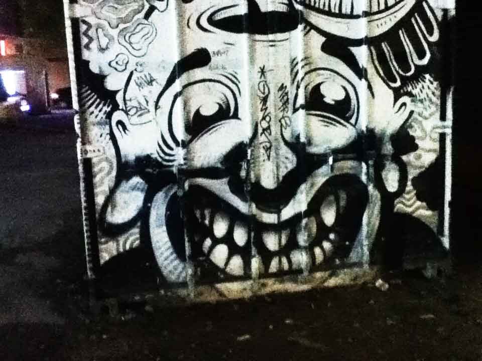
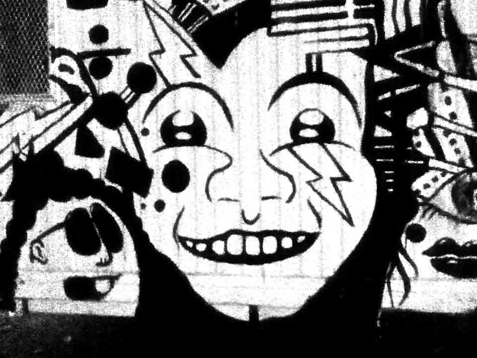
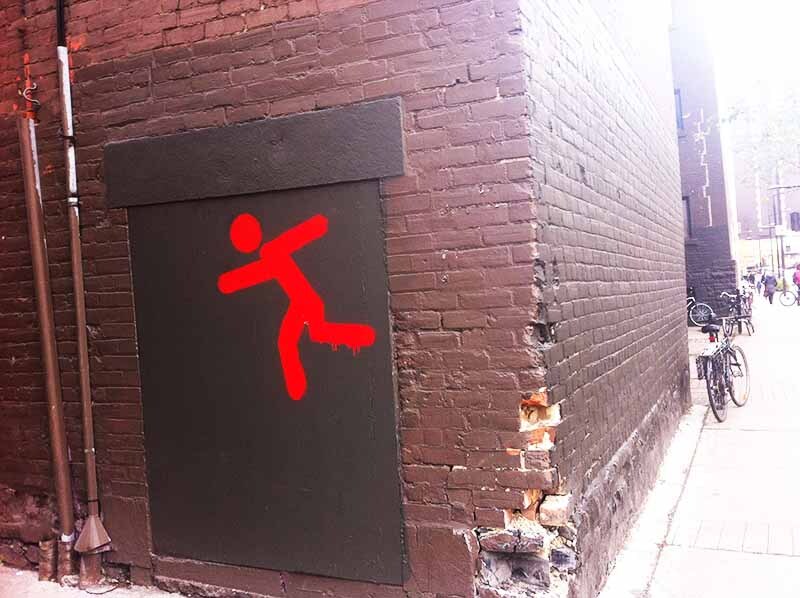
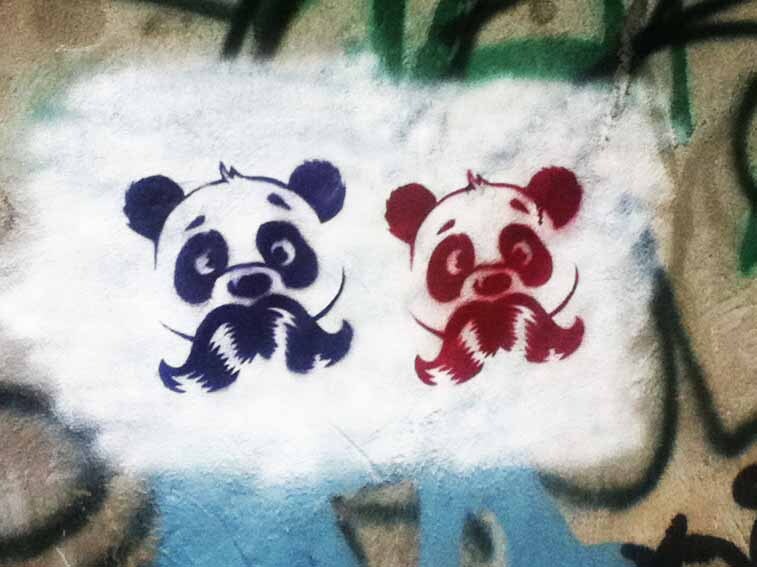
Here's some photos I took of graffiti in Montreal. I've divided them into six categories: creepy graffiti, angry graffiti, defacement of politicians’ campaign signs graffiti, cool graffiti, anarchic graffiti, and of course, panda graffiti.
Creepy graffiti
A dog licking Spongebob Squarepants.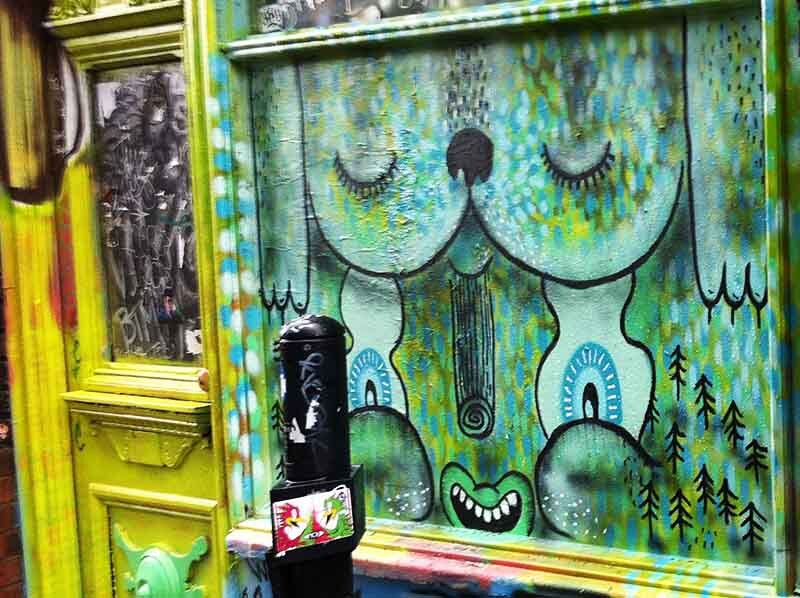
A boy wearing Mickey Mouse ears and with his legs chopped off. He also has a CCTV camera stuck in his eye. This kid's going places.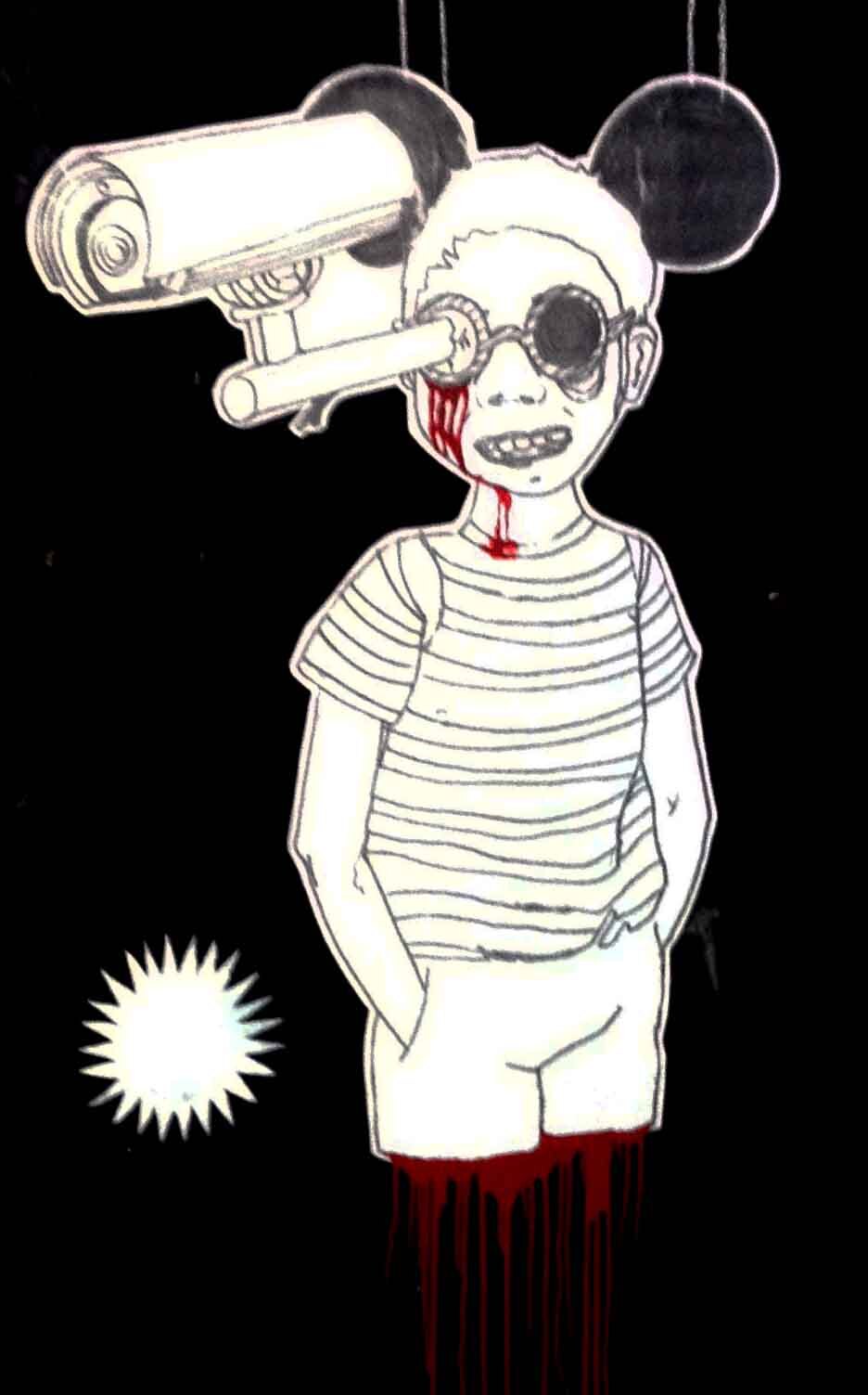
This door is disappointed in you.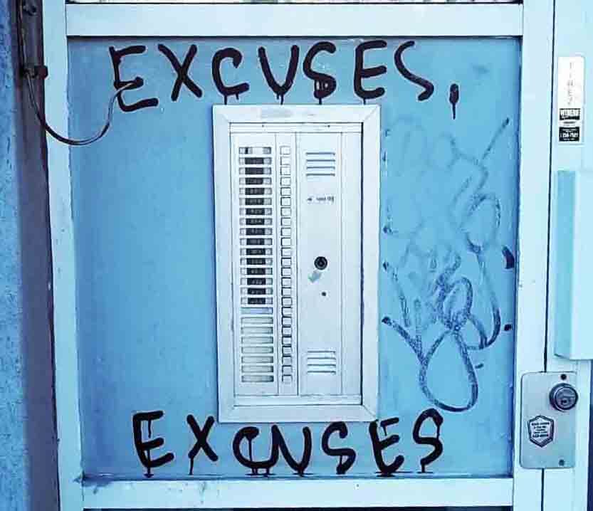
I appreciate its sentiment, but this graffiti creeps me out.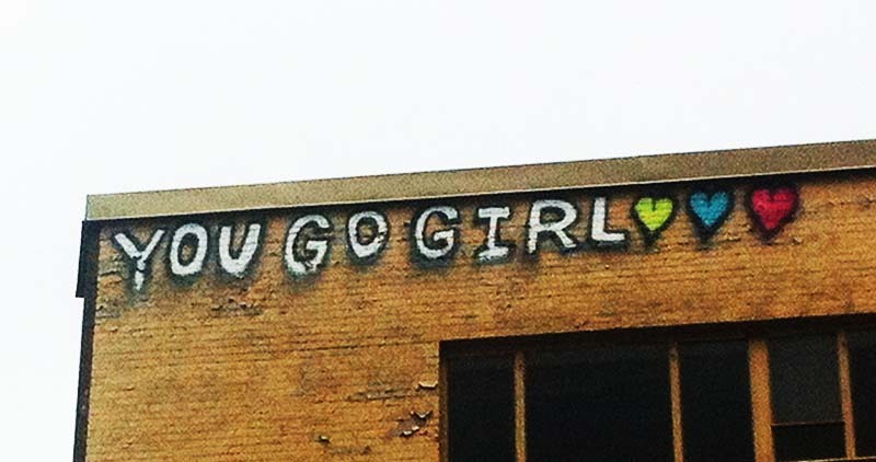
It's some guy carving letters into... another guy's... body? The graffiti is located above a headstone carving company, so that explains the carving at least.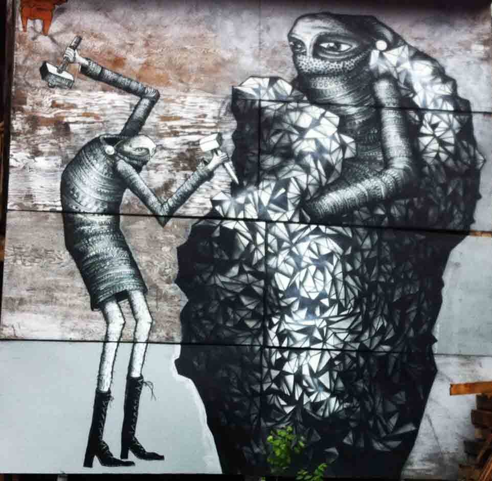
Angry graffiti
Fuck white people, and, er, don't worry about money either.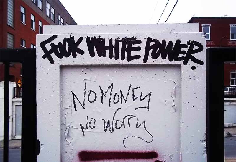
This is a Montreal postbox. A very bad person has written "va chier" on it, which means "go fuck yourself". Nice.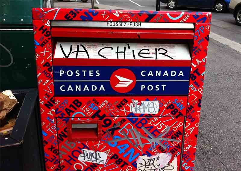
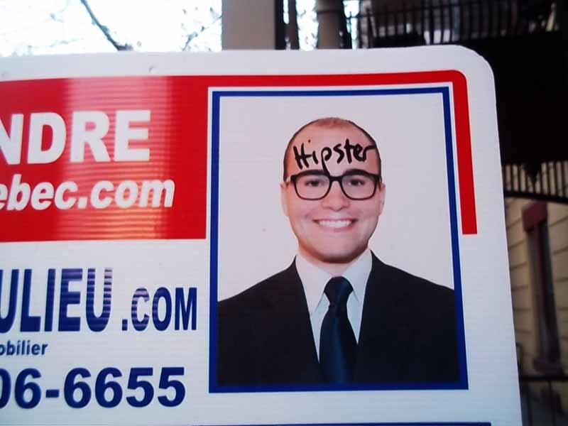
Defacement of politicians' faces
This billboard originally said "Pour le Québec", which means "For Quebec". But someone has added a few letters so it reads "A pourrir le Québec" instead, which means "Let's let Quebec rot".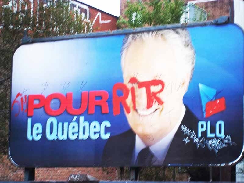
The demon shows its true face! Kill it!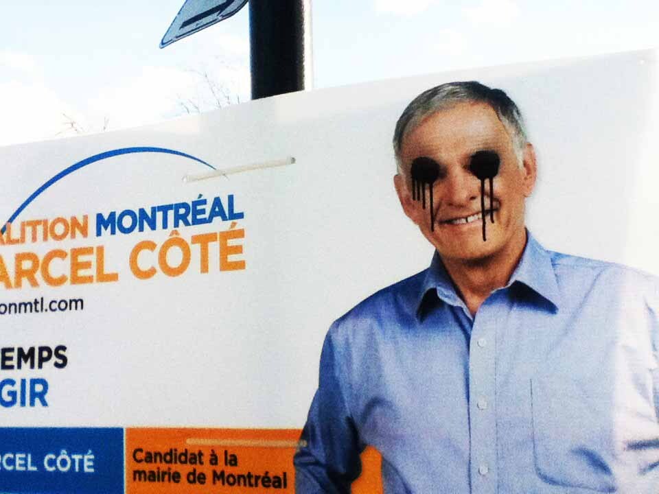
Cool graffiti
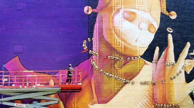
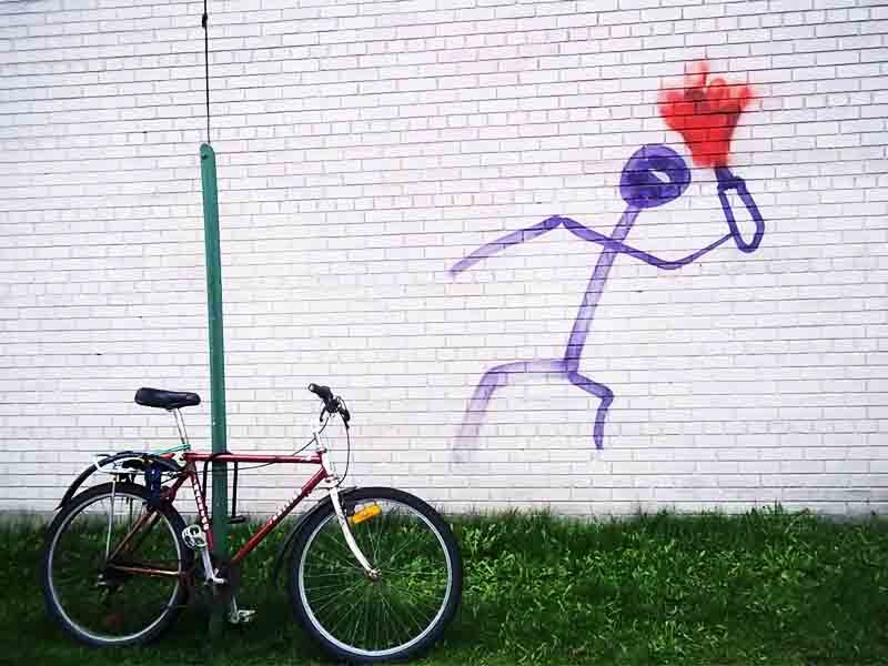
I took this photo when the painter was adding the finishing touches. If you go to Montreal in early August, you too can see artists painting murals. (It's called the Under Pressure festival).
Raccoons fighting their mortal enemies, birds.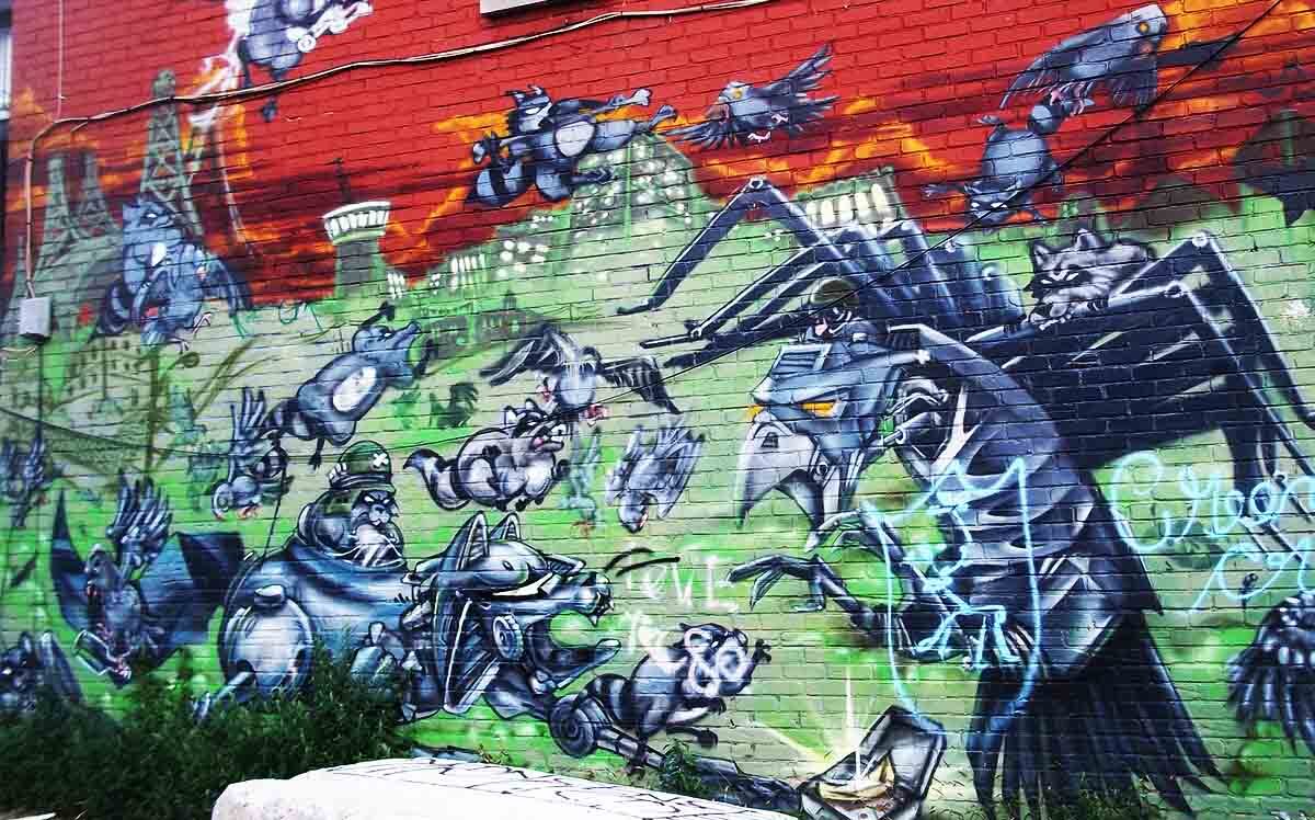
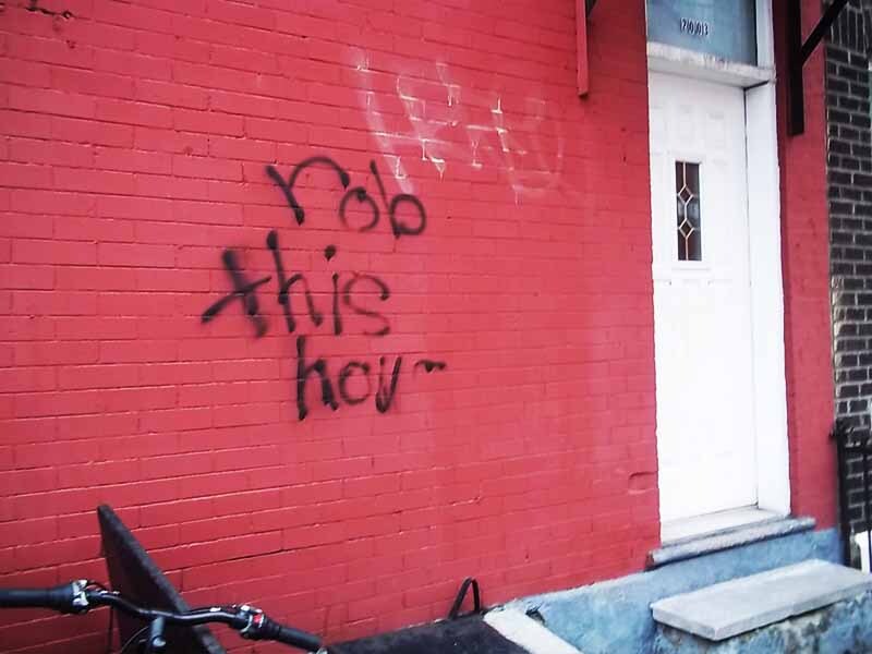
Anarchic graffiti
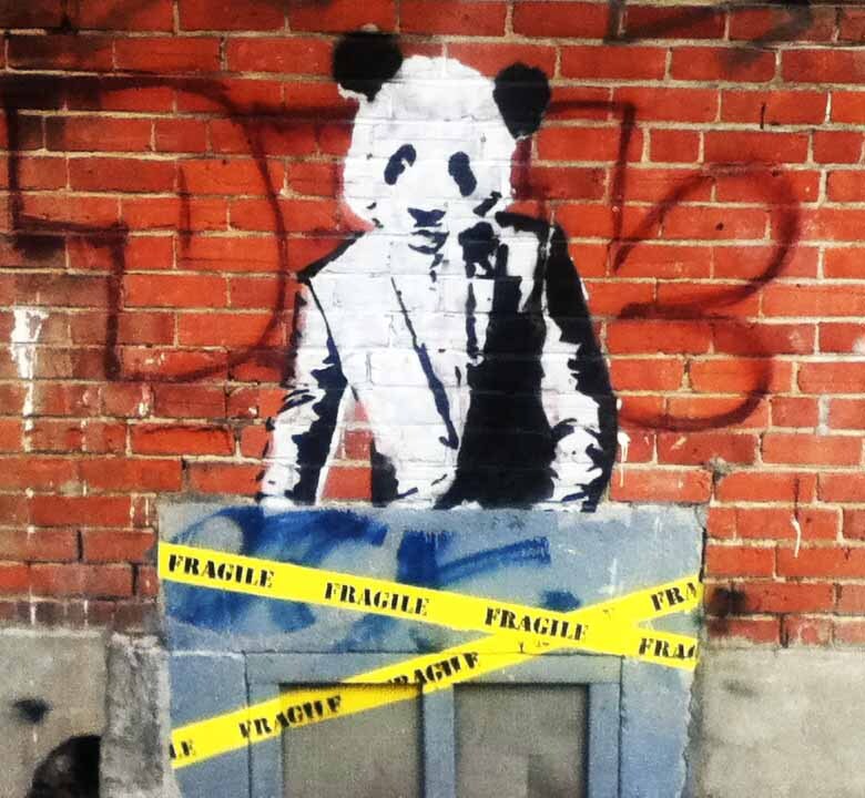
Panda graffiti
Other crazy and creepy shit
I also have cool photos of non-graffiti stuff. Take a look:
This is part of a poster for a play. The kid's exaggerated expression cracks me up. Okay, I'm weird.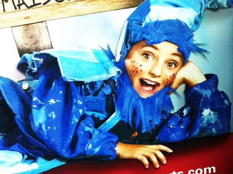
These scary doll people can be found in the weekly offers catalogue of a supermarket called IGA. I'm sure the illustrator had good intentions, but these bug-eyed bitches fall too far into uncanny valley for my liking.
This sinister rabbit was in a store's window display.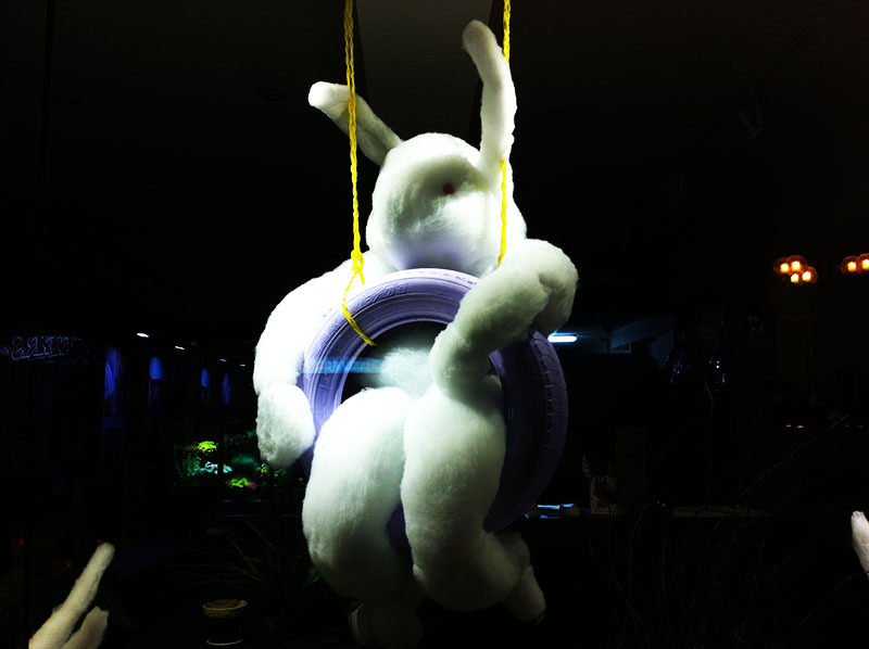
I've seen dozens of Harry Potter covers, but this one wins the award for being the most minimalistic. It doesn't even say which book it is! It simply says "Sorcier", which means "Wizard" in French.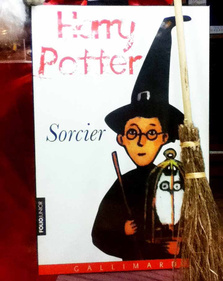
A store selling "Dove pain". Before you complain to the RSPCA, note that 'pain' means 'soap bar' in French.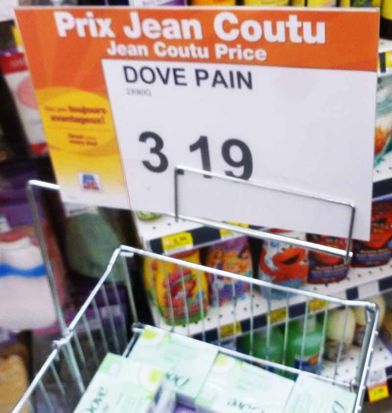
"Wanna see my COQ?" An interesting advert for a company called Coq Events.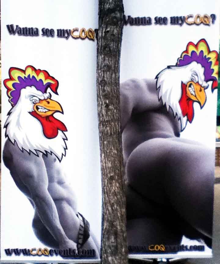
That's all folks.


Leave a comment